A supercharged new AccountKit is coming soon!
Exciting news – we’re refreshing AccountKit to help you get even more out of your toolkit and take your business to the next level.
We launched AccountKit six years ago and the technology has come a long way since then. While developing a range of new workflow tools, we decided a revamp of AccountKit’s user interface was in order to utilise newer technologies and speed up AccountKit’s overall performance.
All this will mean better functionality and control for you, so you can get more done faster, easier and more collaboratively.
Here’s a closer look at what’s changing and the benefits you can look forward to.
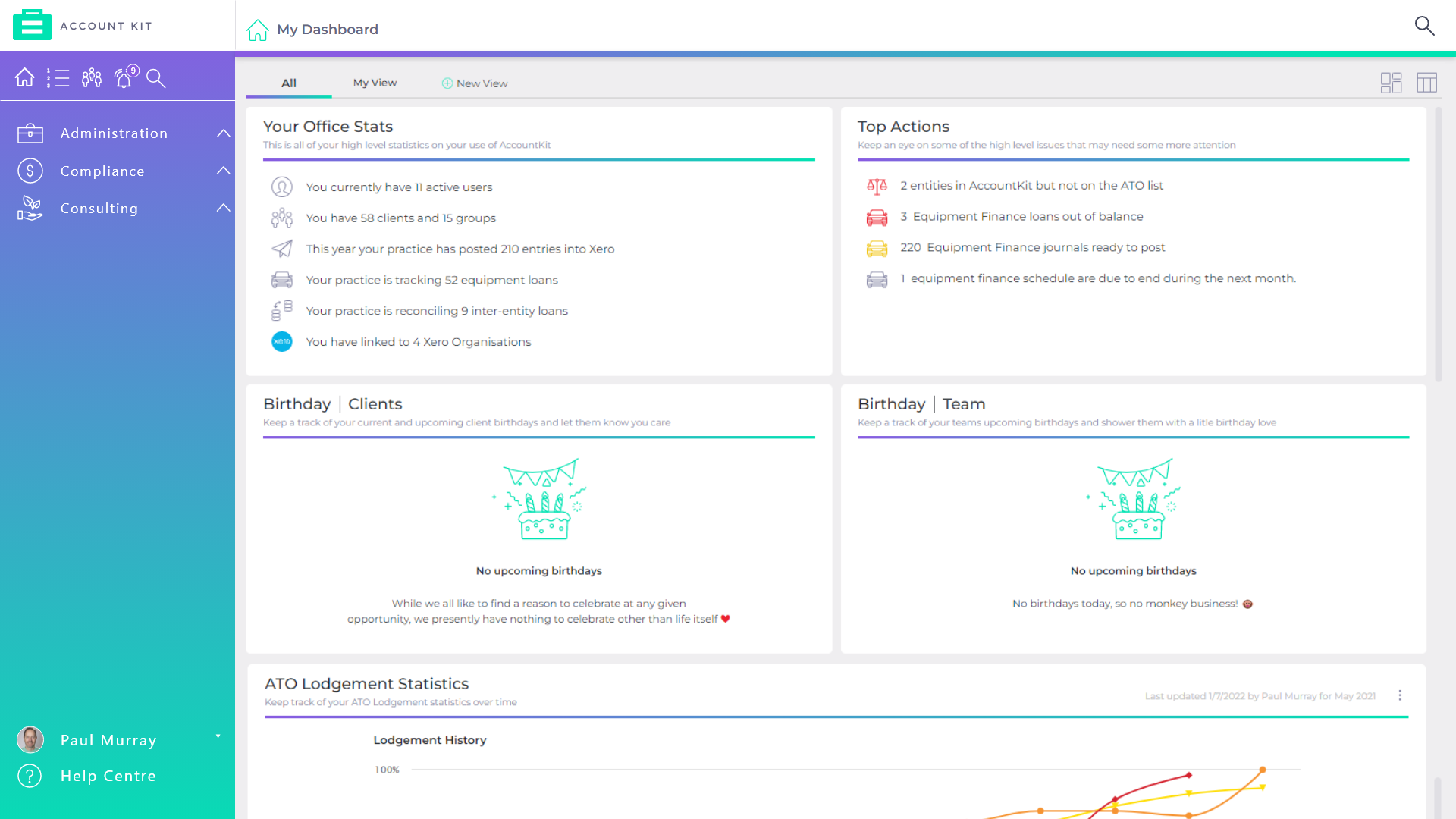
The old AccountKit visuals compared to the new.
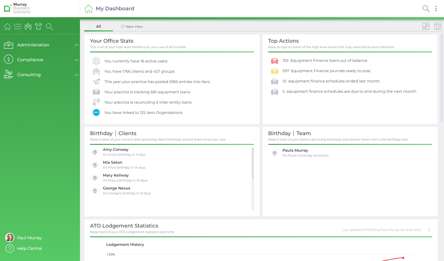
Use the standard branding, or ...
Customise the logo and colours to match your practice.
More intuitive, user-friendly layout
A new full-screen-width layout will make better use of space to allow you to see more at a glance. Tools will be easier to select from the left-hand menu, and Custom Views will be available instead of the Favourites Menu and Quick Client Group filter, including the option to create a view by client or group.
What’s new?
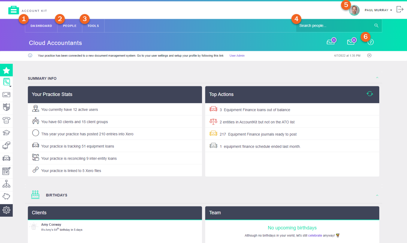
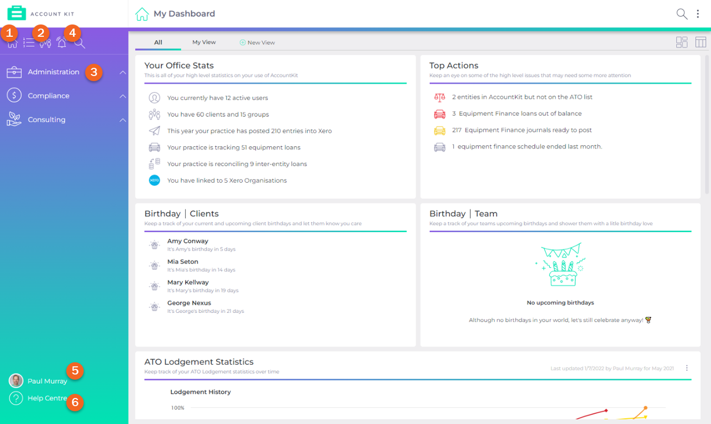
- All tools, Dashboard, Notifications and Search have moved to the top left of the screen.
- My Profile, User Maintenance and Help have moved to the bottom left.
- Favourites bar on the left and the Quick Client Group filter have both been removed.
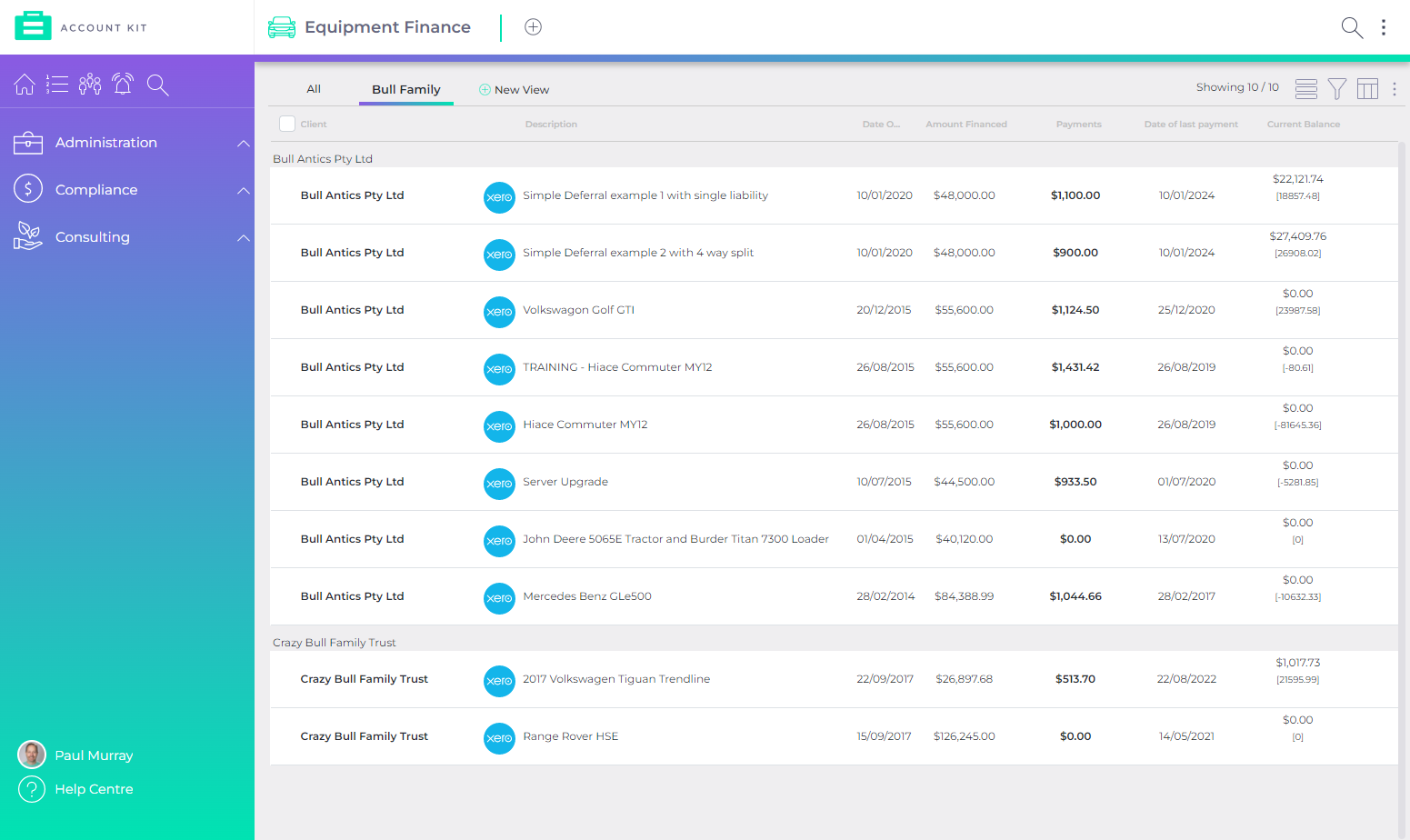
The old AccountKit layout compared to the new.
Old
Custom views
You’ll now be able to create custom views in any tool and save for use individually or across your team. This is a huge time-saver and especially useful for accessing important info quickly, as well as setting up consistent views across your whole practice.
What’s new?
- Create a view in any tool and save for later use or favourite for easy access.
- Custom views can be created individually with the option to share across the whole team.
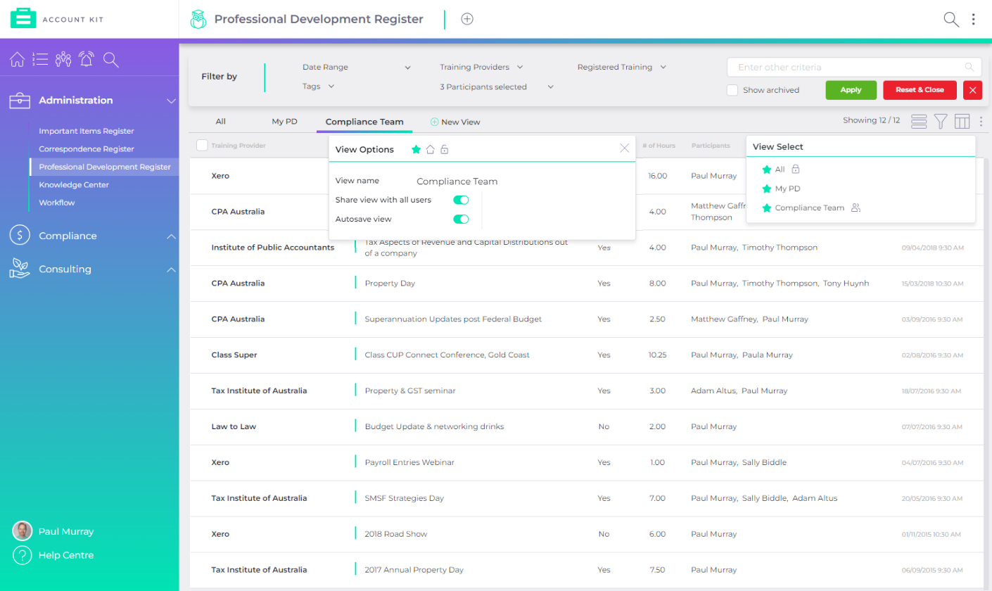
Create a custom view in any tool
List views
Better utilise the full width of your screen and significantly increase speed with our new list views, available across all tools.
What’s new?
- Layout now utilises a full-screen width and height (with the left-hand menu allowing for more vertical space too).
- Get to the information important to you using detailed filters, which you can then save as a new view for quick future access.The feature to change the number of records visible in a list (from 10 records up to 200) has been removed. Now, when you reach the bottom of the list, AccountKit will automatically load the next round of records.
- When you select multiple entries, a bulk action toolbar now appears along the bottom, enabling you to carry out context sensitive actions across all selections (e.g. archive, delete, merge) instead of navigating to a separate action menu.
Faster wide-screen list view layout
Quick access to all your tools
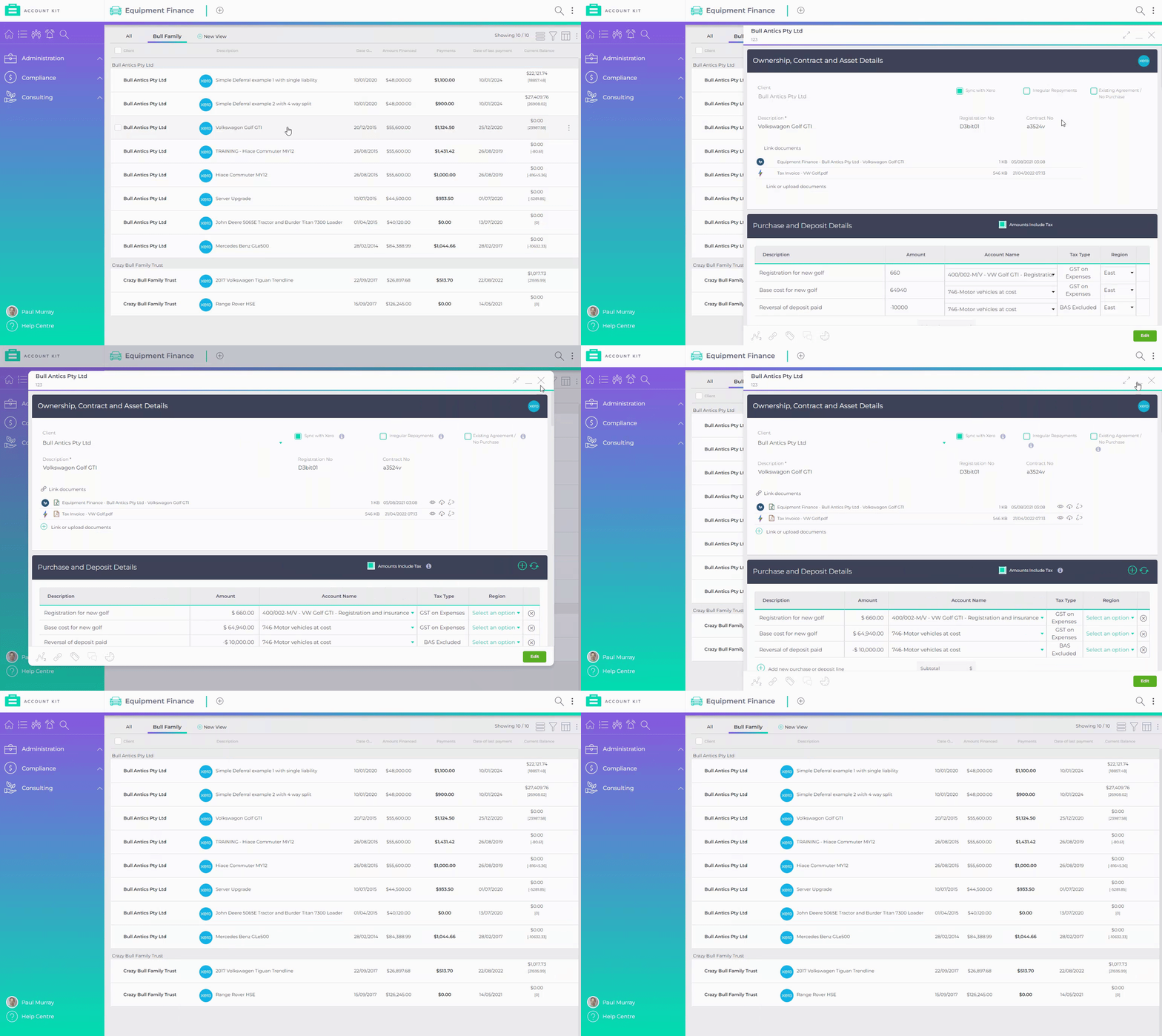
You’ll now be able to view all tools via a right-hand panel, making it much quicker and simpler to switch between tools and records.
What’s new?
- All tools can now be viewed in a pane on the right-hand side of the screen.
- Option to go into full-screen mode for individual tools – great for focusing on the task at hand.
- Minimise tools and easily reopen anywhere in AccountKit.
See all of your content via the right pane, then switch to full-screen mode.
New shared toolbar
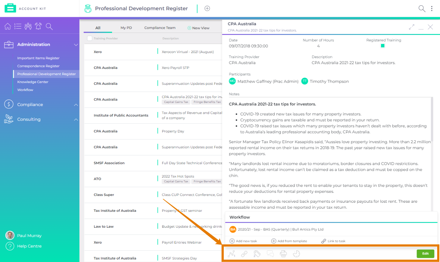
An all-new toolbar standardises common functionality across all tools, improving efficiency and saving time by bringing together workflow, notifications, links and attachments, global tags, audit trail for history and your print / export options.
What’s new?
- Create and link to workflow tasks.
- Consistent place for linking to documents within your chosen document management system.
- Global unified tags across all of AccountKit.
- Capture history of changes for any tool.
- Coming soon: Collaborate with teammates within any tool using a simple @mention to notify the applicable user.
Easy access to the new toolbar at the bottom of all tools
When are the changes happening?
We’ll be rolling out the improvements in mid-late August 2022. Stay tuned for further updates.
Is there anything I need to do?
Once the changes are live, you’ll be given the option in AccountKit to try out the new user experience or switch back to the old interface until you're ready to commit.
Note that all new & updated tools released will only be available via the new interface, so we recommend trying it out as soon as possible to make sure you have access to all of AccountKit’s future updates and features!
At AccountKit, we take high-performance seriously and can’t wait to see how this new functionality gives you the power to perform. We hope you love the new interface and how it can help you get more done faster, easier and more efficiently. 🤓
💗
The AccountKit Team
Ready to see the new AccountKit in action? Join a webinar or book a demo with the AccountKit team.
Share this
You May Also Like
These Related Stories

AccountKit's pricing is changing this August

Wrapping up 2019 – a huge year for AccountKit


